
# Type at least 1 character to search # Hit enter to search or ESC to close
Cart
# Type at least 1 character to search # Hit enter to search or ESC to close
Free Shipping on All Orders Over $19!


Color plays a crucial role in influencing consumer behavior, especially in the food industry. The right packaging colors can evoke emotions, create brand recognition, and even impact purchasing decisions.
The Psychology of Color in Food Packaging
Red & Yellow: Often associated with energy and appetite stimulation, making them popular choices for snack brands.
Green: Symbolizes health and freshness, commonly used for organic and natural products.
Blue: Represents trust and quality but is rarely used for food, as it can suppress appetite.
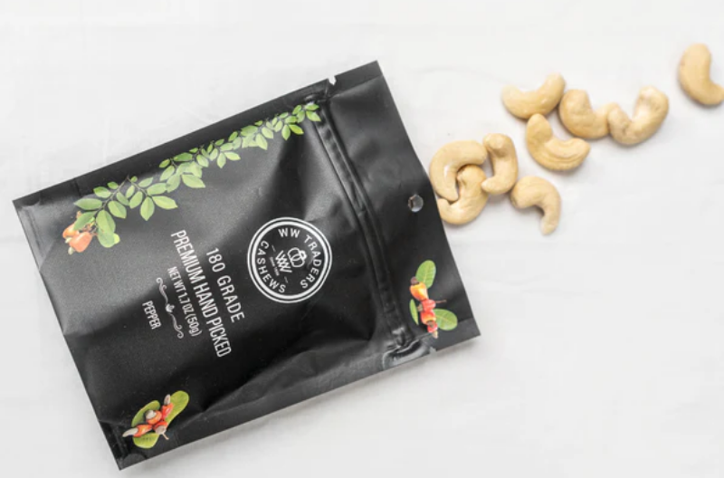
Black & Gold: These colors convey luxury and premium quality, making them ideal for gourmet products.
For example, WW Cashews uses premium packaging with colors that reflect its high-quality, air-roasted cashews. This enhances its appeal as a luxury snack option.
Why It Matters
Consumers often make split-second decisions based on packaging. The right color choice can create an emotional connection, build trust, and ultimately boost sales. Whether you're designing for a new product or rebranding an existing one, understanding color psychology is key to standing out on the shelves.
A well-thought-out color palette doesn’t just make a product look good—it makes it sell better.

© 2026 WW Cashews. All Rights Reserved | 1-888-404-0472 | info@wwcashews.com
Leave a comment